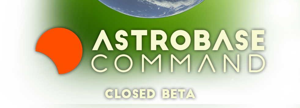
A Fresh Coat of Paint: A New Logo – 10th Aug 2018
Hey everyone, Daniel here!
I’m the guy who makes the graphics for Astrobase Command.
We’ve been at it plugging away on Astrobase Command at good speed since the last blog post we put out but I wanted to take this post and focus on a narrower slice of the work I’ve been doing.
As you may know, I joined the team in early 2014. Since then I’ve replaced the art style, every art asset (sometimes with several iterations), and made many new ones. With one big exception… the logo. True, one of the first things I did was to make the existing logo a bit more appealing and in tune with the retro style, but it was very much still the same design as before.
Ever since then it’s been one of those things I kept wanting to get to but I always had bigger fish to fry (there are a lot of things to do when you are the entire art department of a game this size).
However, recently I finally reached a point where the old logo just couldn’t keep up with the changes in art style since we started. Which combined with its extremely distinct styling making it increasingly difficult to use in combination with other assets. For example it kind of looked out of place with the new website design.
Some of things I’m referring to are the secret cool art stuff I mentioned in a blog post a while back that we still haven’t showed or even told you what they are. But don’t worry, they are still coming. As with everything else that’s part of making a game, the reality of adding stuff in is always more complex than just plopping it in there after the initial content creation process.
Without further ado, here’s the new logo:

As you can see, this is a pretty distinct departure from the old logo.
I hope you can appreciate why I decided to take some pretty large strides design wise and made a logo that is much less complex and should be able to stand the test of time a bit better, while also being more flexible across various use cases.Why does any of this matter? Well, the logo is pretty much the first thing that greets the players both in the game and on the website and needs to be both memorable and look good. It’s important for us (and especially me) that we meet those expectations.
Cheers, Daniel
So, what do you think?
Put your answers in this strawpoll.
And remember!
If you have any further questions about the logo or the game, or you just want to chat, join us on Discord. And if you want to support us further, check out our Patreon.
Get Astrobase Command
Astrobase Command
3-axis space station builder with emotional AI characters and text adventures
| Status | In development |
| Author | JellyfishGames |
| Genre | Simulation, Survival |
| Tags | building-game, City Builder, Procedural Generation, Roguelike, Sci-fi, Space, Space Sim, space-station-builder, starbase |
| Languages | English |
More posts
- 3, 2, 1… Abort! Abort! Abort!May 05, 2021
- Astrobase Command Launch AnnouncementMar 12, 2021
- Astrobase Command 0.4.5 Closed Beta Patch NotesMay 07, 2020
- Astrobase Command 0.4.4 Closed Beta Patch NotesMay 07, 2020
- Astrobase Command Beta Launched!Mar 05, 2020
- The Crew Is Back!Aug 09, 2019
- Summer Shore Leave – Astrobase Command Dev Update – 12 July 2019Jul 12, 2019
- New Crew App, Flashy Terminals, and and Refreshing Our Store Front – Astrobase...Jun 26, 2019
- Astrobase Command Weekly Update – 10 June 2019Jun 10, 2019

Leave a comment
Log in with itch.io to leave a comment.